The tipping point is a term I first heard used by SQL Server performance tuning guru and long-time SentryOne Advisory Board member Kimberly Tripp – she has a great blog series on it here. The tipping point is the threshold at which a query plan will “tip” from seeking a non-covering nonclustered index to scanning the clustered index or heap. The basic formula, which is not a hard and fast rule as there are various other influencing factors, is this:
- A clustered index (or table) scan will often occur when estimated rows exceeds 33% of the number of pages in the table
- A non-clustered seek plus key lookup will often occur when estimated rows is below 25% of the pages in the table
- In between 25% and 33% it can go either way
Note that there are other optimizer “tipping points,” such as when a covering index will tip from a seek to a scan, or when a query will go parallel, but the one we are focused on is the non-covering nonclustered index scenario because it tends to be the most common – it’s hard to cover every query! It’s also potentially most dangerous to performance, and when you hear someone refer to the SQL Server index tipping point, this is typically what they mean.
The Tipping Point in prior Plan Explorer versions
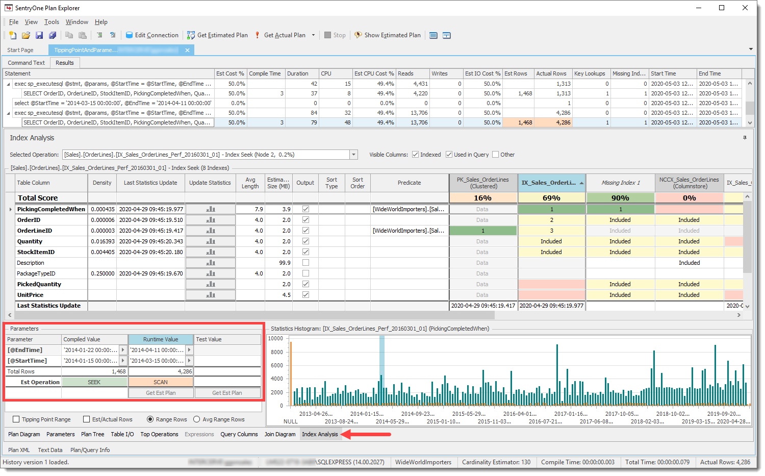
Plan Explorer has previously shown the net effect of the tipping point when parameter sniffing is in play on the Index Analysis tab, specifically via the Est(imated) Operation row in the Parameters pane:
 The estimated operation for the compiled and runtime parameters, based on the number of rows
If you haven’t yet explored the Index Analysis module I encourage you to do so. Although the plan diagram and other Plan Explorer features are great, frankly, Index Analysis is where you should be spending most of your time when tuning queries and indexes. Check out Aaron Bertrand's in-depth review of features and scenarios here, and a great covering index tutorial by Devon Leann Wilson here.
Behind the scenes, we do the tipping point math and predict the index operation (seek or scan) based on the estimated rows and number of pages in the table for both the compiled and runtime parameters, and then color-code the associated cells so that you can quickly see whether they match. If they don’t, as in the example above, it can be a strong indicator that you have a parameter sniffing problem.
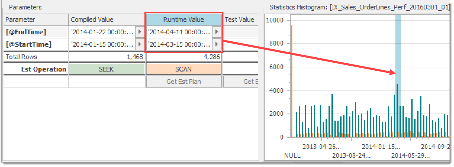
The Statistics Histogram chart reflects the distribution of values for the leading key of the index using columns for equal rows (orange) and range rows (teal). These are the same values you’ll get from DBCC SHOW_STATISTICS or sys.dm_db_stats_histogram. The parts of the distribution being hit by both the compiled and runtime parameters are highlighted to give you an approximate idea of how many rows are involved for each. Simply select either the Compiled Value or Runtime Value column to see the selected range:
 Histogram chart showing the range hit by the runtime parameters
New Controls and Visuals
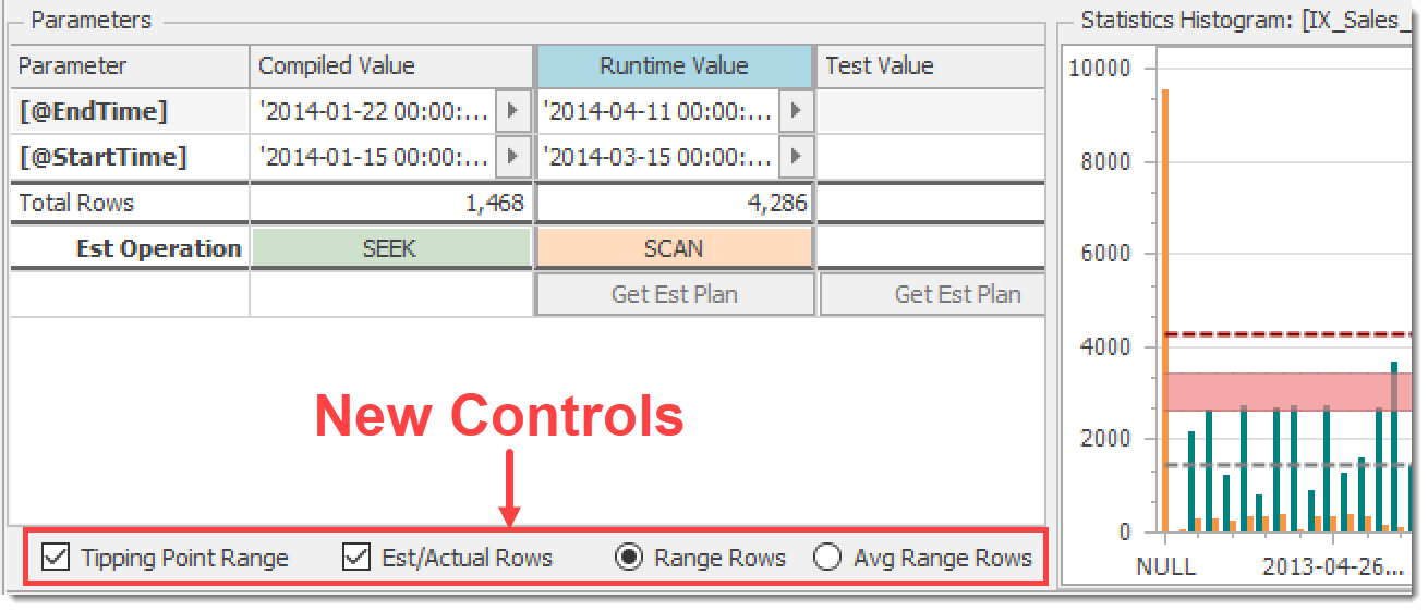
The above features were nice, but for a while I’ve felt that there was more that we could do to make things clearer. So, in the latest release of Plan Explorer (2020.8.7), the bottom of the Parameters pane has some new controls with associated visuals on the histogram chart:
 New controls for histogram visuals
Note that the histogram shown by default is for the index used by the query to access the selected table, but you can click on any other index header or table column in the grid to view another histogram.
Tipping Point Range
The Tipping Point Range checkbox toggles the light red band shown on the histogram chart:
 Toggle for Tipping Point Range band
If the estimated rows are below this range, the optimizer will favor a seek + lookup, and above it a table scan. Inside the range is anyone’s guess.
Est(imated)/Actual Rows
The Est/Actual Rows checkbox toggles display of estimated rows (from the compiled parameters) and actual rows (from the runtime parameters). The arrows in the chart below illustrate the relationship between this control and the associated elements:
 Toggle for Estimated and Actual Rows on the histogram chart
In this example, it’s clear that the estimated rows are below the tipping point and the actual rows returned are above it, which is reflected in the difference between the listed estimated and actual operations (Seek vs Scan). This is classic parameter sniffing, illustrated!
In a future post I’ll drill into how this correlates to what you see on the plan diagram and statements grid. In the meantime, here is a Plan Explorer session file that contains this example (seek-to-scan parameter sniffing) as well as a scan-to-seek example. Both leverage the expanded WideWorldImporters database.
Range Rows or Average Range Rows
Prior versions of Plan Explorer stacked the equal rows and range rows in one column to represent the total number of rows in a histogram bucket. This works well when you have an inequality or range predicate as shown above, but for equality predicates it doesn’t make much sense. What you really want to see is the average range rows since that’s what the optimizer will use for the estimate. Unfortunately, there was no way to get this.
In the new Plan Explorer histogram, instead of a stacked column series we now use clustered columns with the equal rows and range rows side-by-side, and you control whether to show the total or average range rows as appropriate using the Range Rows / Avg Range Rows selector. More on this soon…
Wrapping Up
I’m really excited about these new features, and I hope you find them useful. Try them out by downloading the new Plan Explorer. This was merely a brief introduction, and I look forward to covering some different scenarios here. As always, let us know what you think!


Ouch. I hate to say this, but that rule just is flat out not true at all: https://www.brentozar.com/archive/2020/05/no-you-cant-calculate-the-tipping-point-with-simple-percentages/
Brent, in my testing it actually does hold true much of the time, enough to merit the new functionality.
As Kimberly says in her series posted at top, "It depends… it's MOSTLY tied to the number of pages in the table. Generally, around 30% of the number of PAGES in the table is about where the tipping point occurs. However, parallelism, some server settings (processor affinity and I/O affinity), memory and table size – all can have an impact. And, since it can vary – I typically estimate somewhere between 25% and 33% as a rough tipping point (and, you'll see from a bunch of my examples, that number is not EXACT). "
As with most things in SQL Server it's certainly not a hard and fast rule, and I can add some more qualifying text in case folks don't read through the background by KT.
I'll also look into the example in your post to see if there is more we need to do here. If you have others please share.
Post updated as follows:
"The basic formula, which is not a hard and fast rule as there are various other influencing factors, is this:
– A clustered index (or table) scan will often occur when estimated rows exceeds 33% of the number of pages in the table
– A non-clustered seek plus key lookup will often occur when estimated rows is below 25% of the pages in the table
– In between 25% and 33% it can go either way"
Perfect, thanks! Yeah, that accurately reflects the situation, and it'll help folks understand that it's not a rule. Thanks!